Have you ever tried to describe something indescribable to someone only to fumble for the right approach and the right words and simply give up the effort by saying “you had to be there?” For example, imagine trying to paint a mental picture of the Grand Canyon for someone who has never seen it in person or in photos using only words. You start by stating the facts. It’s a big hole in the ground, a canyon, with a river running through the bottom. Then you simply start spewing words: erosion, red rock, enormous. Expectedly, all you receive are blank stares and a furrowed brow.
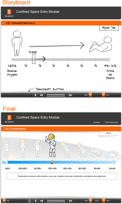
At KMi, our eLearning content developers often run into similar troubles when attempting to express courseware concepts in visual terms. That is why we storyboard our custom eLearning solutions. The storyboard is a preproduction visual concept that does wonders for bridging the gap between wacky designer visions and client understanding. We know our clients don’t always think like us and we don’t want to make the process any more difficult. Our customized eLearning storyboards are non-functioning, static graphics. They usually introduce the module skin design along with rough sketches, low resolution placeholder photos and production labels describing functionality and animated features.
In the below example we can see the eLearning content development storyboard for a Supply Chain safety course explaining the graphical style and user interaction and then the final result.


